TUF Barbershop Logo Design
TUF Barbershop: Brand Identity Logo design · Brand system · Colour
TUF Barbershop — short for The Urban Fade — is a grooming studio rooted in Cebu's street culture, blending traditional barbering with a lifestyle-driven, contemporary atmosphere. Founded in 2015, TUF redefined the local barbershop experience at a time when the grooming space in Cebu was largely underdeveloped, introducing a standard that valued detail, craft, and cultural relevance in equal measure. It earned Best of Cebu honours four consecutive years running, and has since grown to 33 branches across the Philippines.
Scope of work: Logo design · Brand system · Colour palette

Concept
In 2015, barbering culture in Cebu still carried the weight of antiquity — functional, traditional, unremarkable. TUF was built on a different proposition: modern, precise, and quietly confident. The logo had to reflect that shift — as clean and exact as the cuts themselves. A deliberate play on a cut above the rest, rendered without irony.
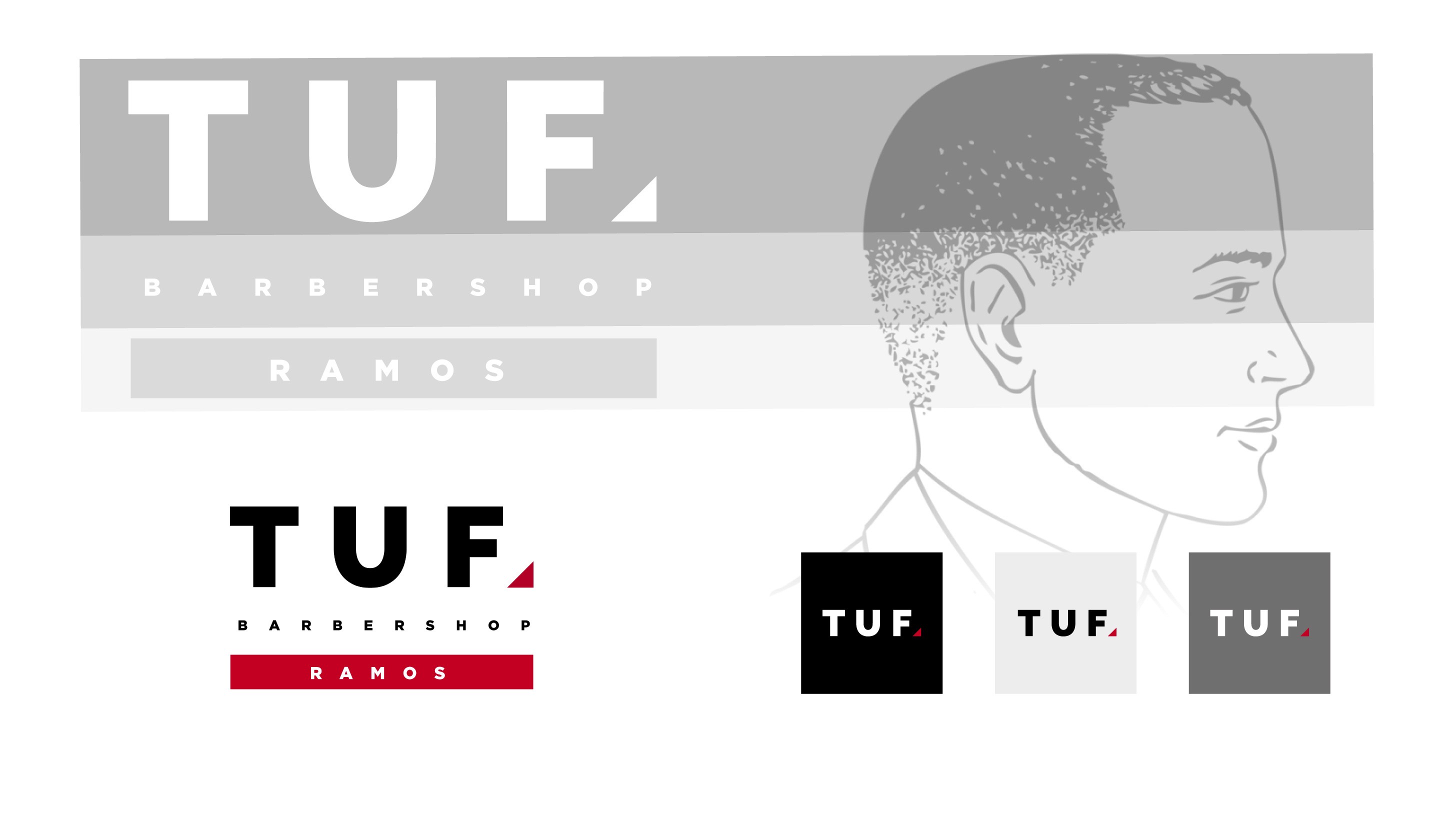
Mark & System
The logomark uses a stacked structure that directly mirrors the anatomy of a standard fade haircut — fade line, fade length, and taper — embedding the craft of barbering into the form of the identity itself. The system was designed to recede rather than dominate: a deliberately limited three-colour palette ensures the logo integrates seamlessly into each branch's interior without competing with it. The space takes centre stage; the mark simply belongs there.
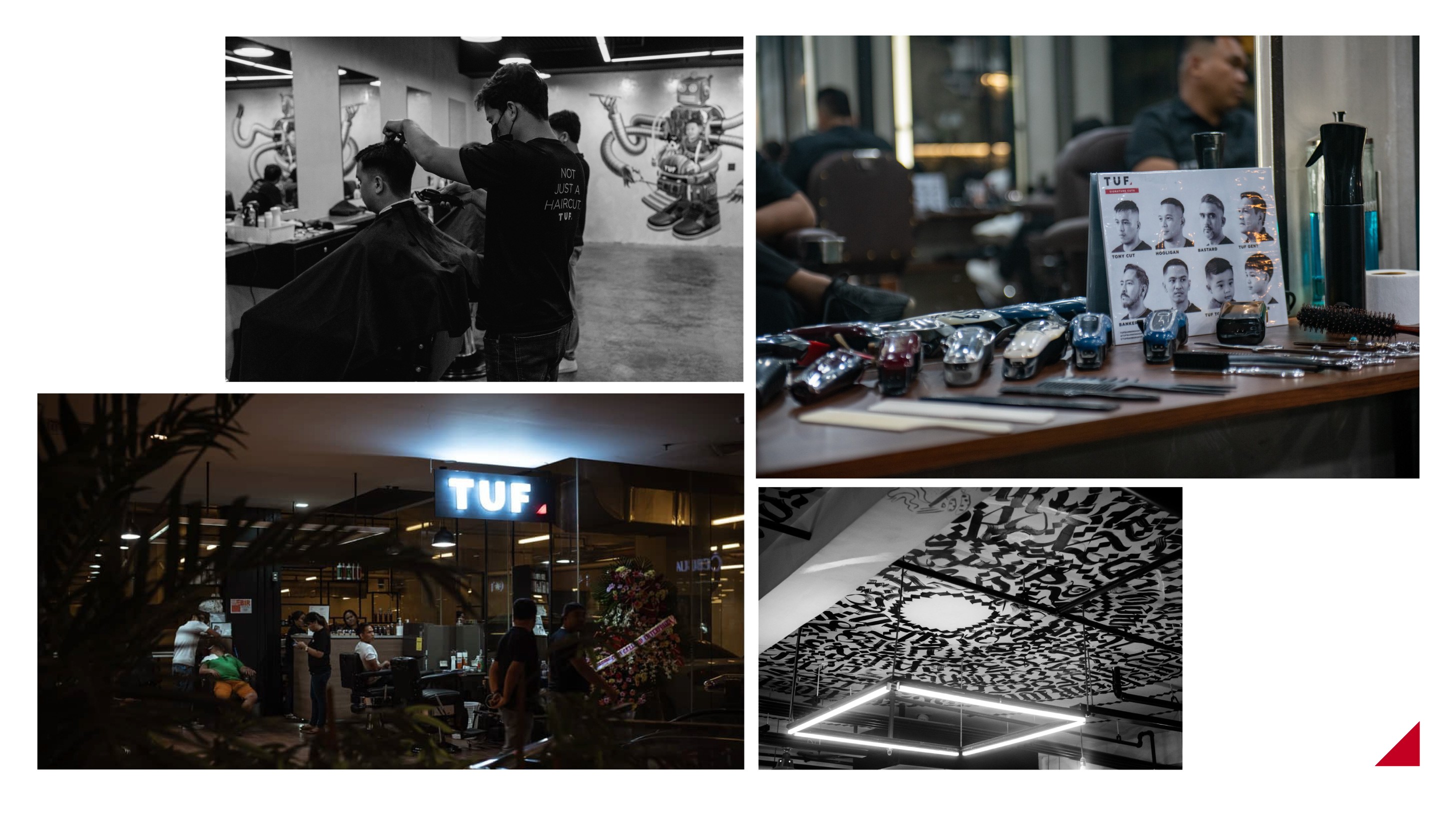
TL: Mural by DaotART; LR: Ceiling piece by Archie Geotina
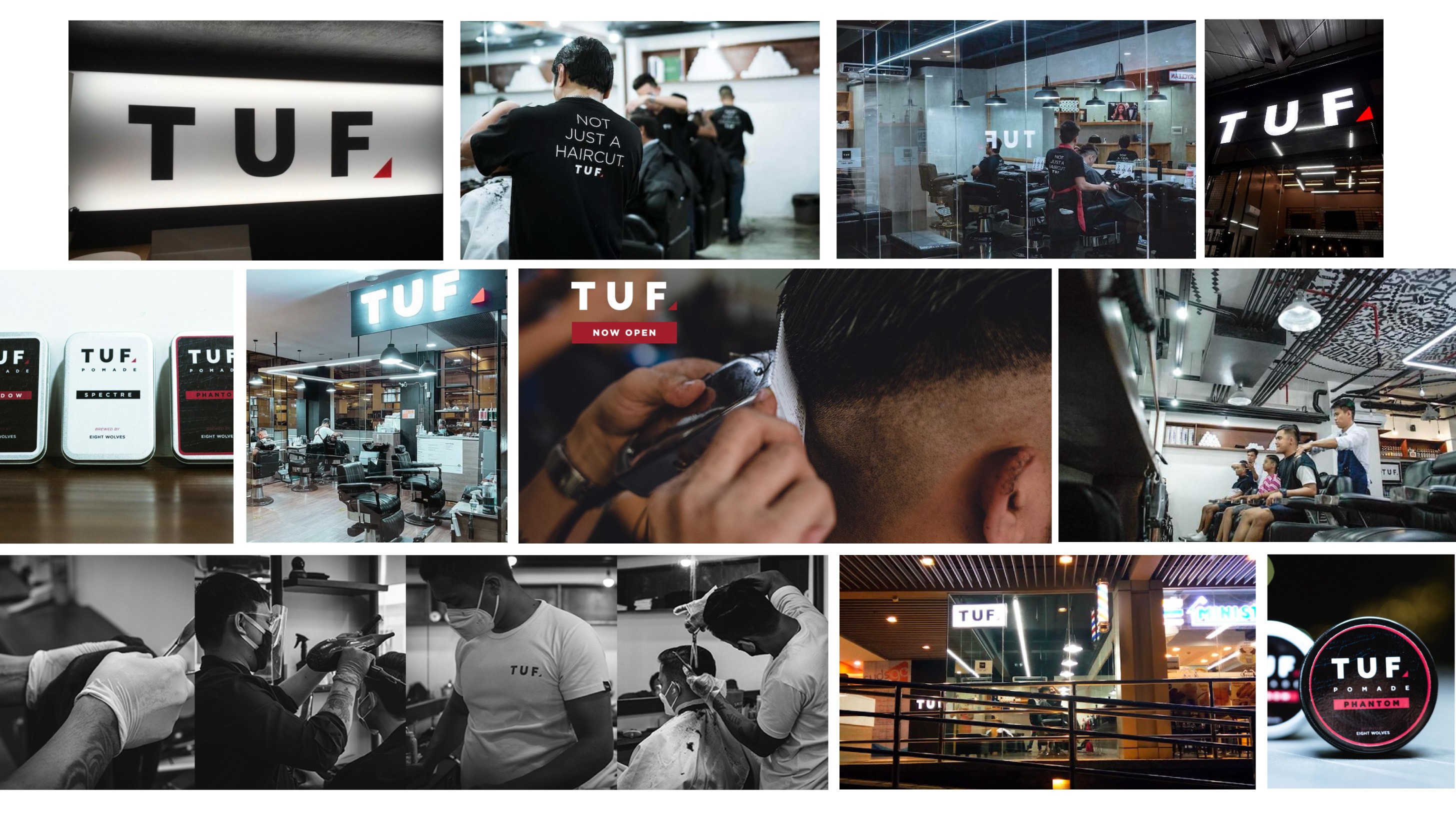
Photos courtesy of TUF Barbershop.
© 2025 All rights reserved. Chad Manzo